Bitcoin, the world’s largest cryptocurrency, is often described as digital gold—volatile, valuable, and eyed by traders and institutional investors alike. Whether you’re a newcomer to crypto or a seasoned trader, analyzing the Bitcoin stock chart is essential for tracking live price trends, understanding market dynamics, and making informed decisions. With Bitcoin’s price history marked by dramatic swings and record-high rallies, a close look at its chart offers not only a snapshot of its current performance but also insight into its evolving role within global finance.
The Mechanics of a Bitcoin Stock Chart
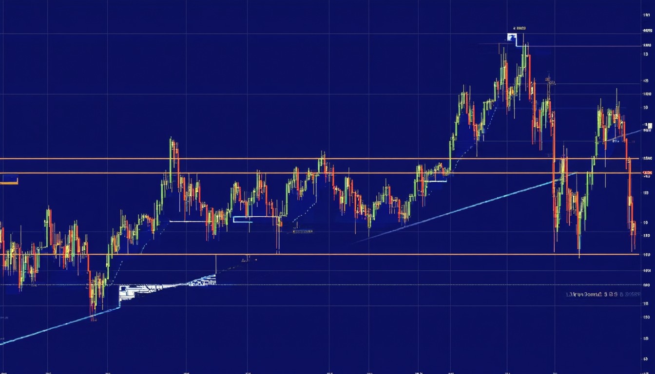
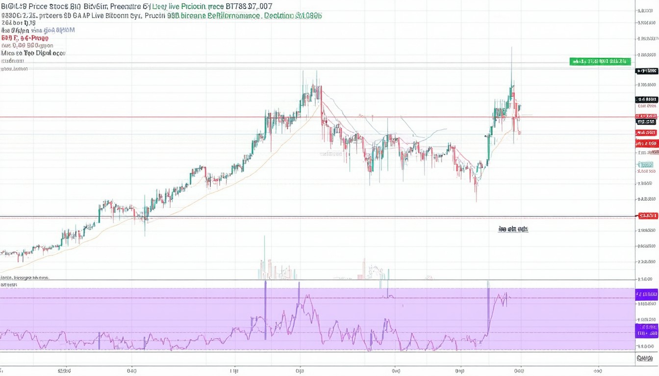
A Bitcoin stock chart visualizes Bitcoin’s price movements over time, typically on platforms such as TradingView, Coinbase, or Binance. Similar to charts used for traditional stocks, these charts employ candlestick or line representations to display historical and real-time price fluctuations, trading volumes, and key technical indicators.
Chart Types and Key Metrics
- Candlestick Charts: Each candlestick shows Bitcoin’s opening, closing, high, and low prices for a given time period—valuable for identifying bullish or bearish trends.
- Volume Bars: Below the main chart, these bars represent how much BTC was traded during each interval, indicating momentum or potential reversals.
- Moving Averages (MA): Popular indicators like the 50-day or 200-day MA help smooth out volatility and reveal underlying trends.
- Relative Strength Index (RSI): This momentum oscillator ranges from 0–100, indicating overbought or oversold conditions.
These elements, when interpreted together, allow technical analysts to assess market sentiment, spot potential entry and exit points, and gauge the strength of a particular trend.
Timeframes Matter
Bitcoin’s price action varies across different timeframes. A 1-minute chart suits day traders chasing short-term gains, while weekly charts help long-term investors withstand volatility and focus on macro trends.
In practice, analysts often cross-compare multiple timeframes to confirm the validity of patterns or signals. This approach guards against short-term noise skewing longer-term strategies.
Key Historical Trends in Bitcoin’s Price Chart
Few assets have seen fluctuations as widespread—or as studied—as Bitcoin. Since its inception in 2009, Bitcoin has transformed from a niche digital experiment into a trillion-dollar asset class. Its stock chart records a thrilling narrative of repeated boom-bust cycles, punctuated by technological upgrades, regulatory shifts, and growing mainstream adoption.
Major Bull Runs and Corrections
- 2013: Bitcoin broke the $1,000 barrier for the first time, only to crash sharply afterward.
- 2017: Its meteoric rise to nearly $20,000 was followed by an 80% drawdown within a year, mostly attributed to speculative mania and regulatory uncertainty.
- 2020–2021: Fueled by institutional interest and pandemic-era liquidity, Bitcoin topped $60,000 before undergoing another sharp correction.
Amid these cycles, savvy traders use stock charts to visualize support and resistance zones—levels where buying or selling pressure historically shifts the tide. Well-known events like the halving (when Bitcoin mining rewards are cut in half) are anticipated by participants and reflected in chart activity months in advance.
Real-World Factors Driving Trends
Institutional adoption, policy changes from governments, or macroeconomic shifts—such as inflation fears—can all influence the Bitcoin chart in real time. The arrival of Bitcoin exchange-traded funds (ETFs) and payment integrations by companies like Tesla have further fueled price surges, each event mirrored by noticeable spikes in trading volume and momentum indicators.
“A single regulatory headline or the launch of a high-profile ETF can send Bitcoin’s price—and its chart—into uncharted territory, illustrating how this asset remains both global and incredibly sensitive to external catalysts.”
— Tara Williams, Senior Crypto Analyst, FinScope Research
Tools and Techniques for Analyzing Bitcoin’s Stock Chart
Beyond simple price tracking, investors and analysts deploy technical analysis frameworks that borrow from both the stock market’s playbook and crypto-native methodologies.
Technical Indicators in Depth
- Moving Averages: Crossovers, such as when the 50-day MA overtakes the 200-day MA (“Golden Cross”), are classic bullish signals—though never infallible.
- MACD (Moving Average Convergence Divergence): Tracks momentum and trend direction, signaling potential reversals.
- Fibonacci Retracement: Estimates possible support/resistance by dividing past price moves according to the famous Fibonacci sequence.
Chart Patterns
Repeated forms like “head and shoulders,” double tops, flags, and wedges appear across all timeframes. While these patterns never guarantee future moves, they provide a visual shorthand for prevailing market psychology.
Many traders overlay these patterns with on-chain data such as wallet activity or transaction flows, trying to blend technical with fundamental analysis for a holistic market view.
The Role of Sentiment Analysis
Social media trends, Google search volumes, and crypto derivatives data are increasingly integrated into chart-based strategies. Sudden spikes in Bitcoin mentions on Twitter or dramatic options activity can reveal the kind of euphoria—or fear—that often precedes large chart moves.
Live Price Trends: Navigating Real-Time Data
Unlike traditional stock markets, Bitcoin trades 24/7. This round-the-clock liquidity creates a constantly evolving chart but also invites unique volatility.
Tracking Live Data Feeds
Modern charting tools offer:
- Real-time candle updates on multiple exchanges
- Order book visualizations showing live buy/sell pressure
- Dynamic overlays for key news headlines
Professional traders rely on these features to react swiftly; for everyday investors, simple mobile apps provide user-friendly access to live charts and price alerts.
Beyond this, algorithmic bots and high-frequency trading platforms now dominate significant trading flows, with price moves on one major exchange like Coinbase quickly echoed across the global landscape.
Bitcoin’s Chart vs. Stock Charts: Key Differences
At first glance, the Bitcoin stock chart may look familiar to equity traders, but important distinctions remain.
24/7 Trading Environment
Conventional stocks operate within fixed exchange hours and downtime. In contrast, Bitcoin’s around-the-clock marketplace amplifies volatility and can produce gapless price series—any movement, any time.
Fundamental vs. Technical Driver Balance
While corporate stocks are driven by earnings, corporate actions, and sector trends, Bitcoin’s fundamental drivers are more abstract: technological adoption, network security, regulatory signals, and macroeconomic sentiment. Chart reading for Bitcoin thus leans more heavily on technical and sentiment indicators than on quarterly financials.
“Bitcoin charts demand a hybrid approach. Price alone is rarely the full story—on-chain trends and macro events often rewrite the script overnight.”
— Julian Martinez, Portfolio Manager, BlockBridge Capital
Strategies and Best Practices for Chart-Based Bitcoin Trading
With so many variables, developing a disciplined approach to Bitcoin chart analysis is essential.
Golden Rules for Chart watchers:
- Avoid Emotional Trading: High volatility can induce fear-of-missing-out or panic selling. Sticking to a pre-set strategy, rather than chasing headlines, is crucial.
- Diversify Timeframes: Confirm signals across several chart intervals, from minutes to weeks, before acting.
- Combine Indicators: No single metric is infallible—use a blend for more robust decision-making.
Learning from Market History
Every major crash or surge visible on the Bitcoin chart harbors lessons for patient observers. As financial infrastructures around Bitcoin mature, including the broader acceptance by institutions and emergence of sophisticated derivatives, chart patterns may evolve—but the principles of technical analysis and risk management remain constant.
Conclusion
Bitcoin’s stock chart is a window into both the psychology and the reality of this dynamic asset. From wild bull runs to nerve-wracking corrections, chart analysis has become the cornerstone of modern Bitcoin investing and trading. Staying informed about major trends, combining technical and sentiment indicators, and approaching the market with a disciplined mindset can help participants navigate Bitcoin’s ongoing evolution and volatility.
FAQs
What is a Bitcoin stock chart?
A Bitcoin stock chart visually represents the price movements and trading volumes of Bitcoin over selected periods, helping users analyze trends and make informed decisions.
How do candlestick charts work for Bitcoin?
Candlestick charts show Bitcoin’s high, low, opening, and closing prices within chosen intervals, making it easier to spot patterns and shifts in market sentiment.
Why is Bitcoin more volatile than most stocks?
Bitcoin trades globally, 24/7, and is influenced by factors like regulatory news, adoption events, and macro trends, resulting in higher price swings compared to most equities.
What are common technical indicators used in Bitcoin chart analysis?
Popular indicators include moving averages, RSI, MACD, and Fibonacci retracements, each offering unique perspectives on trend strength and possible future movements.
How do real-time Bitcoin price charts help traders?
Live charts provide up-to-the-second data, enabling traders to respond quickly to price changes, volume surges, and key market events as they unfold.
Is technical analysis reliable for Bitcoin?
While technical analysis is widely used and can help identify probable trends, it is not foolproof; combining it with fundamental insights and sound risk management is advised for best results.